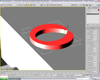
In order to create the sink, I would need a shape which would realistically hold water competently.
Under 'Extended_Primitives' there was the 'RingWave' option and I decided to alter some of the default settings of it to see what happened - this image shows when I specified 'no-growth' on the 'RingWave_Timing' setting and selected 'Outer_Edge_Breakup', increasing the crawl time and width flux so that the pinnacle of the shape pinched inwards as shown
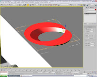 By adding the taper modifier and specifying the 'Taper_Axis' as 'Z' on the primary and 'XY' on the effect, a bowl shape has formed
At this stage, I was inherently worried that, as I had tried with a couple of the 'Extended_Primitives' before, this object may not 'Boolean' properly when I want to add on the Transparent texture for the water in the 'bowl'
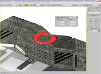 ^Here, the sink is placed where it should go for the Ident to play out ( I hadn't checked whether it would 'Boolean' correctly at this point!)
Note: By Right_Clicking on the 'Move' icon, it brings up this window shown here which is primarily for when an object's location details need to be copied down^
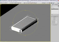
I needed a draining board for the plates to go on (well, for one of them to stay on, the 'Sci-Fi' one will slip off anyway!)
By creating a box and, making sure there were 10 width segments , applying the lattice modifier formed this object shown here
The lattice modifier generated the exact struts I wanted for a real space-age looking cutlery/utensil drainer - especially in the chrome finish...
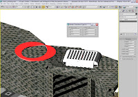
As before with the 'Move' icon, by 'Right_Clicking' the 'Rotate' icon, I can accurately adjust the individual digits on the X, Y and Z co-ordinates, as well as the shapes dimensions (by which you can see that the drainer is now shorter, but taller)
At this stage, I had also tried to Boolean the sink, but as I feared, the shape just kept taking on the properties/textures of the worktops!
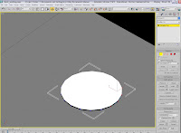 I needed to re-create a plate for which the Sci-Fi material would be placed and although I had tried positioning it before, its very temperamental in both the 'scaled_tiling' and the X,Y and Z tiling for it to be adjusted to be in the right area
The cylinder is very thin, as I wanted to be able to use the 'Bend' modifier without it inverting itself and so messing up the UVW Map application. I have selected it by the vertices shown here
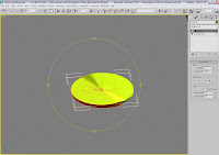
By selecting half of the cylinders vertices, I was able to apply the 'Bend' modifier to only one half of the cylinder, shown here
Bent on the 'Y' axis, at an angle of 3.5 and a direction of -122.5, the image shows how the plate looks on one side
I now need to figure out how to apply this to the other side without re-setting the figures
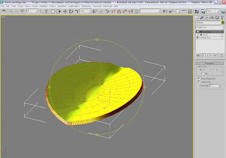 ^I discovered the 'Symmetry' modifier would, when applied, be able to mirror the settings onto the other vertices for me (a welded seam with 0.1 threshold) without any hassle of adding on another 'Edit_Poly' layer into the hierarchy'
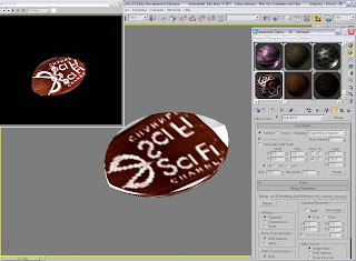 Now that the plate was finalized, I needed to adjust the Sci-Fi texture to fit the plate as well as possible
I knew there would still be some slight tiling issues (as Max's adjustments only work to two decimal places!), but I was going to consider tampering with the 'Blur_Offset' so that there would an almost double-outline of the text
Firstly, but adjusting the angle of the texture, I was able to centre the image and get a result as shown top-left (the mirrored look didn't work...)
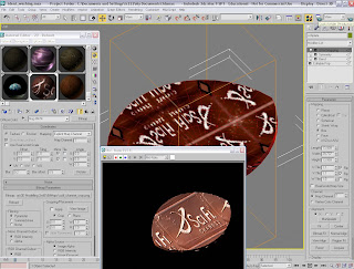
I reached this point where I became slightly confused, as the image shows. Whatever I was adjusting with the material on-screen, the rendered version didn't show anything remotely similar to whats on the scene!
So, I decided to reapply the UVW Map and carry on with the Blur(Offset) The scaled tiling needed to be mirrored for this part and with 'Blur' set at 0.2 and the 'Offset' at 0.5, I changed the textures alignment to the 'X' co-ord.
The U and V tiles were at 1.1 and needed to be 'flipped'
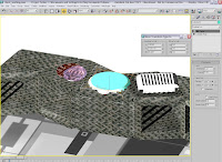
Now that I'd done away with the original sink idea, I decided to just add in a cylinder, taper it and apply the transparent material from there. All it needed was to be integrated into the worktop and have minor adjustments the 'taper' settings. Again, the 'Move Transform Type_In' window helped to make fine adjustments to the position of the sink before applying the texture
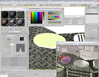 Although quite a complex process, the texture needed should take on the characteristics of water in this settings and reflect the light in the room realistically (even if Si is on the Moon...) A 'Raytraced Shadow' was selected, with the 'Phong_Shader' as a preset. Three diffuse colours were present, which I changed to the tones best suited to the kitchens natural ambiance. A bump raytrace was added, with the 'waves' preset for extra detail. The image shows the relevant windows and how it looks rendered.
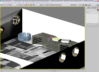 ^The scene is set for Si to be 'merged' with this current set-up. I had previously tried to import him, textures and bones as well, but this caused hell and all problems later on when rendering as the bones had lost their 'skinned' settings when attached to the limbs!^
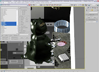 After merging Si into the scene, I discovered a tool will undoubtedly be a life-saver due to amount of bones I needed to include in order for his tentacles to move properly. The 'Selection_Floater' is just a window which you can use and, as it lists all the objects in your scene, you can then select each of them however you want. Also, notice how the reflective part of Si's lizard skin texture glistens in the lights as if its still moist
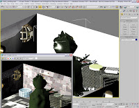 It was at this point when I realized I hadn't rendered the scene from near the ceiling to see if all the lighting and texture-application would still look presentable
As shown in the image on the right, the light in the corner throws a generous glow across the sink area, but still retains the shadows and doesn't damaged the reflective qualities of the water
Especially, the wall on which the light is attached is actually detailed where the panels have highlights along the edges too!
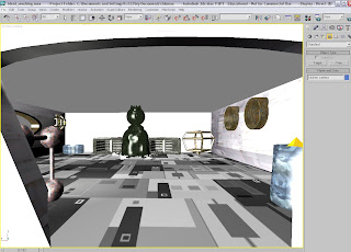 ^This is actually the first static shot of what the camera will see when the Ident begins. Of course the starry-sky-textured ceiling will be brought down lower to give that complete effect too (all I need to to is slide it sideways, such is the way I've set it up) Also, below is a rendered version - I'm really impressed now that all the interior details are sorted and its just a case of animating it all now!)^
No comments:
Post a Comment