 Having given up on attempting to get the textures that I have in the library onto my glasses, I thought I would continue with what I call the 'ambient objects' into the scenes
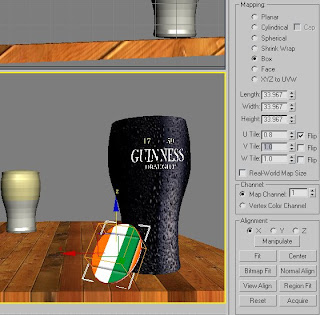
I decided the most effective way of doing this was to include two beer mats, one with the Irish flag on, and one with the seminal four-leaf clover
Typically, 3DS Max avoided adding the texture on the correct object, and therefore prevented me from adjusting the bitmap to the exact layout which fitted the cylinder best
As the image shows, I had to resort using the UVW Map for it to even appear, used the 'Box' map and then decreased the tiling on the U and the V segments to 0.8 and 1.3 respectively
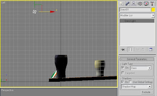
By now, lighting was needed for me to gain an abject and concise view of how the final image could look, now that Id incorporated an environment map.
As the map had a bar interior consisting of ceiling light fittings and a large opening of natural light filtering in from the bar entrance, I thought to have a set of two 'Omni' lights, set to a direct pattern, with a shadow map assigned to the object.
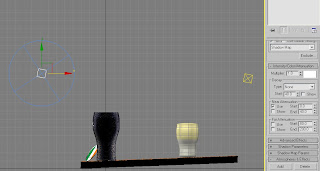 ^Diagram shows both 'Omni' light positions, as well as the settings used to throw the lighting and creation of the shadows that are currently in the scene (near attenuation selected starting at 0 and ending at 40 points, with a decay starting at 40 points, although unselected at this point)
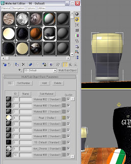
Now it got a mite bit complex. Having returned to the beer glasses after remaining happy with the lighting arrangement, I thought of an idea to which I could have access to all three textures both glasses would incorporate and be able to edit them all as part of one material
I began the process by highlighting the three varying sections I wanted f the glass itself, numbering each one a separate ID eg. 'head' 1, centre 2, and base 3
Now this was confirmed, I could then select the 'Multi/Sub-Object' layering option and incorporate all three textures that, up until this point, had all been ruthlessly applied and reapplied and, however I admit it, were not going to happen without an in-depth reassessment of my options
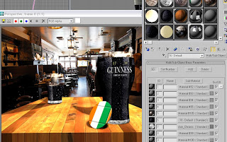
Having applied the 'Multi/Sub-Object concoction to the glass at the rear (after having to add the UVW map again - for some reason, I'm sure he computer just didn't have faith in my abilities at pretty much every stage of my Max-usage so far!), I also repeated the process for the forward glass, again changing the IDs for each of the sections and then adding the map on as required (also, by upping the specular levels and glossiness, I could include some believability of the lights above reflecting off the glasses) Of course, this glass hasn't been touched yet, compared to the half-empty glass behind (yes, I could be classes as a pessimist by saying half-empty, but this is the easier to type than full...sorta!) Again, that's the reasoning behind why I increased the size of the head section of the rearward glass and below is how I got the map...
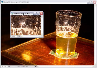 ^By finding an image of a half-drunk glass on t'internet, I had the perfect idea for a crop and bitmap-object-orientated texture which could be applied to the head of the glass, with the opacity adjusted so that it has a natural transparency to it^
NOTE: Look away now if you don't want to see a sneak preview of my second finished calender
image...
Ok, you sure you want to see it...
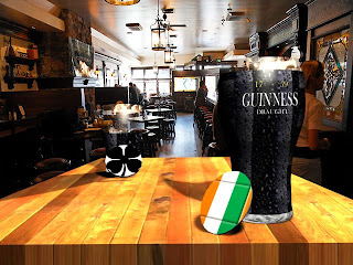 As is clear, the shadows thrown by the dual Omni lights above (one just behind each glass in their respective positions to the table) help the image to appear more integrated to the environment around it.
By raising certain values with the materials placed on each of the surfaces as well, this also encourages greater light sensitivity and adaption to the overall scenes layout adds appeal
Be prepared for another lengthy post on Thursday, and, as you have been prepared before, it will be a two part-er spanning onto next Monday - Valentines Roses will be the name of the game, and I hope you can find it in your heart to appear a little more subdues by my oh-so-effeminate choice of subject matter...its a sensitive side to an otherwise mildly one-dimensional individual, believe me...
 ^By finding an image of a half-drunk glass on t'internet, I had the perfect idea for a crop and bitmap-object-orientated texture which could be applied to the head of the glass, with the opacity adjusted so that it has a natural transparency to it^
NOTE: Look away now if you don't want to see a sneak preview of my second finished calender
image...
Ok, you sure you want to see it...
 As is clear, the shadows thrown by the dual Omni lights above (one just behind each glass in their respective positions to the table) help the image to appear more integrated to the environment around it.
By raising certain values with the materials placed on each of the surfaces as well, this also encourages greater light sensitivity and adaption to the overall scenes layout adds appeal
Be prepared for another lengthy post on Thursday, and, as you have been prepared before, it will be a two part-er spanning onto next Monday - Valentines Roses will be the name of the game, and I hope you can find it in your heart to appear a little more subdues by my oh-so-effeminate choice of subject matter...its a sensitive side to an otherwise mildly one-dimensional individual, believe me...

No comments:
Post a Comment