Tuesday 2 December 2008

Week 11 Part 2 - An Brief Evaluation of the Finished Imagery

This is bascially my last post, and is a summery and brief evaluation of each of the three calender images, including the aspects that worked and the ones that didn't so well - definately a fitting end to a well-rounded project that tested many of us to improve markedly over the weeks (Im sure we're all pleased with what we have achieved!)


OCTOBER:
Halloween - Graveyard Scene


> Aspects that worked well

~ The actual construction of the stone itself wasn't too strenuios for me to create. I was also quicte lucky with the textures as they wrapped in just the right manner for them to appear natural. Also, the lighting that highlights areas such as the headstone , but still includes heavy lowlights on the vertical pillars make the 'stone look as 3-dimensional as possible
~ The ground itself was another aspect that turned out just as I wanted. The elevations and humps that I created to improve its realsm and naturally-occuring alterations, combined with my custom-map (mostly due the fact that 3DS Max had no decent ground textures) , meant that I could feel confident it actually turned out better than I was expecting
~ The successful positioning of the moon in relation to the light source throwing the shadow over the bush and 'stone itself again was not deliberate, however I planned the environment initially

> Aspects that didn't work so well

~ For the central section of the stone, I orignally managed to created a stressed and cracked version of what i tturned ot like, but, for reason unknown to both myself and my Lecturer, 3DS Max couldnt fin my original materials Map I created, and so I lost that one...
~ Even though I used that correct texutre for the effect I was trying to re-create, the 'dead/dying bushes' look ended up looking slightly like they had a swarm of orange caterpillars on them..although, Im sure thats just my imagination talking..


MARCH: St Patricks Day - Irish Pub Scene


> Aspects that worked well

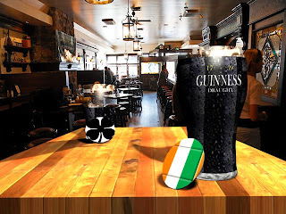
~Throughg all the time and effort they took to re-create, I finally managed to get the Guinness glasses to look nigh-on exactly how I enviseged. As is described over the weeks, I tried many ideas of how to get the right textures on the correct areas, but many ideas were either not effective enough or just made the glass look far too false!
~The inclusion of the two beer mats, although seemingly insignificant, I feel really add to the scenes genuine celebration to the Irish Holiday of St Patricks, specially with the flag and four leaf clover motifs
~As with the previous image, I still feel my lighting has brought the image closer to reality, taking into the account the environments present lighting, which is why I included the "ceiling lights" throwing shadows that could easily occur naturally in a real-rendition of this scene

> Aspects that didn't work so well

~ I suppose, as a case in point regarding research into finding suitable enviroment maps to have as background imagery, the only real let-down was perhaps a lack of high resolution public-house images to use. Many portrayed pubs that weren't exactly ideal for inclusion in the scene, and some even ruined by bad lighting (even so, I still feel my image is the most suitable that I found, but I couldn't help thinking that using an image with St Patricks paraphenalia on-scene would have been alot less time consuming for me to include artificially!)


FEBRUARY: Valentines Day - Bunch of Roses


> Aspects that worked well

~ The lighting, although only a single lighting source and indirectly deflected away from the camera, I feel adds a sense of realism - possibly candelight or mood lighting in the room...
~ Perhaps less significant than the main throw of the bunched roses, nevertheless the little gift tag/ribbon combo really sets off the gift that could be given by any self-respecting gentleman to his love(!)
~ The textures for the roses thorns and stem, even though not shown here, as well as the leaves which are clearly present, worked effectively to convey the 3-dimensional feel and shiny surfaces of the materials, just as they are in real life

> Aspects that didn't work so well

~ There were indeed problems with the construction of the initial rose, especially with the petals and central stamen (if thats what its called with roses!) which had about three incarnations in their development, ranging from basic splines and UVW Maps, to an attempt an extruding NURBS, from which ideas such as the petal layering and the central stamen(?) came about
~ Although I tried my best to make the surface appear more intergrated in the scene, the wood material, I would say, isn't as heavily defined as the other textures, especially since the strong lighting (perhaps could have been improved by increasing the bump mapping?)


Well, its offically complete - I know, its been full of trials and tribulations, but it's all been worth the occasional stress-sessions and program glitches.
Besides, if I hadn't been metaphorically thrown in the deep end, as it were, I can bet my life that I wouldn't have been so keen to really prove what I can learn in a few short months after first using as complex and mind-bendingly frustrating as 3DS Max...!


Monday 1 December 2008

Week 11 - A Gift Of Roses

Well, the second from final week and I'm sure glad its here (well, in terms of finishing off this modeling doohickey) because, as has been demonstrated over the past few weeks, there has been times where it seemed like the program almost glitched in a couple of ways :- especially of note was the amount of occurrences when I was applying textures to completely separate objects with completely different object names/ID's and the texture appeared on another object not touched by my mouse click..but, hey, we got there in the end...


I hereby discovered how difficult it is to just apply one texture. The trouble is that I have had to achieve a sense of realism and true-form from the most irregular sources - but, for this instance, to get the leaf texture, I had to find a top-down leaf view and crop the image, as the image shows
Having saved this as a BMP, I then carried on into materials editor and imported the image into the 'diffuse colour' channel
The image below-right shows the settings that were applied


When the material appeared as it has in this example, I was very pleased to see that at least the leaves were not needing to have the UVW map - unlike the stem and thorns (more on that story later!)
All I needed to do to make it was by increasing the specular level and a medium grade of glossiness


I then moved onto adding textures to the stem.
With this again, I grabbed a full-size rose image from the web, and basically carried on the method as I have done all through this project - get an image, crop it, save as a BMP
I needed to use the anisotropic map, however, to get the anisotropy and orientation values that allowed me to achieve the material values I wanted.
It wasn't working first of all, until I upped the diffuse level value to 250, then it became very detailed, with plenty of shadow and highlight detailing

I then needed to UVW map the stem, because the material wasn't adhering itself to the cylindrical form correctly. Therefore, I decided to use the 'shrink-wrap' mapping parameter, with a U tile value of 7.5, a V tile of 3.5 and a W tile of 1.0
By doing this step, the stem then gained a slim reflective layer as you rotated it - a definite bonus when rendering for the final image!


And so, I began on the petals and adjusting their vertices's so that they took the form of a raggedy, uneven rose petal, each one unique.
I attempted to use a 'complete stack selection', but the program would not batch adjust the objects, even though I had named them as a single instance label
*The blue pointers give you the handles to pull and deform the sections you select*


^The image above gives you some idea of how this 'vertex-manipulation' process affected the petals^

^Above image shows the settings with which I created the texture for the thorns which, yes its true, they are actually blood red^


Once I had completed the rose to a standard I was happy with, I then, as the image shows, cloned the object as 'copy', firstly a group of two, then four to get all eight on screen.


Now that there were eight separate instances of the original rose object, I was initially having trouble with moving each of them without altering the form of another. So I decided it was in my best interests to 'Group' each one - being that I don't have the need to alter the original design any more, I can fully mobilize each one, with no fear of accidentally moving a thorn or petal, for example
What I was going to need to do, in order to order them in the correct positioning for further adjustment, shown in the image is an example of almost regimental alignment and this then gives me a almost neutral basis on which I can then decide the final presentation of them on the surface I have chosen.


^ The first step was to position each rose as a single 'Group' instance as if it were resting on a solid surface, and so, after drawing out a simple 'plane', I could get an idea of what could be plausible on this surface (so I began to position the roses as such...)^

^ Due to the even number of roses I had on-screen, I thought upon setting down a two rows of four, with the eighth rose nestling somewhere on top (this image shows this method at the early stages with a mixture of the 'Rotate' tool and 'Move' tool to get each one to appear as though its stem is resting on t'other one^


Once I had the roses in position (e.g. laying on top of each other, with the leaves and stems all settled in a realistic manner, with nothing looking too "obviously- manipulated"!), I began to put the finishing touches to the image, as it were
I decided to add a piece of ribbon (oddly, the program chose pink as I drew the line out which was ideally thought out!) and extrude in to the value of 0.35, with only a single segment, with capping at both start and end
I knew that I could then add on a little trinket or another item associated with a Valentines gift, but I decided that I could throw in one more technique that, even though small, was well worth adding in to increase realism for this scene.


The idea came to me once the 'Boolean' option was displayed on their screen - if I could make a hole onto which the piece of ribbon could fall into, I could almost make a little gift tag or small card that usually comes with these delivery of roses on Valentines Day
And, so I lined up the end of the ribbon just as it began to curve over itself with the top centre of the tag, drew out a sphere (the equivalent size of a standard ball-bearing) which I then moved into the position you see in the image
I selected the tag with the 'Move' tool and then the 'Boolean' setting under the 'Compound Objects' option, and where it asked to "Pick Operand B", I selected the sphere, which then removed material away from the tag exactly in the place where the sphere was previous.


^Shown above is the lighting source that was chosen to give the image and very atmospheric ambiance to it - I was thinking in terms of a candlelit dinner when choosing the 'Spotlight' option, with a 'Target Directional Light' as the modifier, and I also chose to turn 'Shadows' on as an option, with the rose heads and gift tag very much the centerpiece of the image^

^This image demonstrates one of the last Photoshopped images I created. I found the heart-and-arrow as a basic image on the Internet through an image search and I decided it needed a more personal touch, so off it went to Photoshop as I created two extra layers of text in the symbolised red tonal palette. The settings for the Map in the Material Library are also shown^


Well, I will be posting my last one tomorrow, as I convinced myself that there wasn't much I could do with any of the images now, given the tight timescale that this project has used throughout. To give fair notice, the post will include the three final images and a brief evaluation that covers all the positives and negatives of each, y'know, just so i can assure myself that this project was carried out to the best of my abilities - and that is all can be asked of us...

NOTE: No, I do not know why Blogger has insisted on applying the Italics for the complete post, not just for the opening and closing paragraphs, specially since I cannot deselect it...whatever next!!

Thursday 27 November 2008

10th Week Part 2 - A Bunch of Fives..Roses, that is!

Well, never thought Id be saying this but...two down, one to go. Luckily, through some mildly intelligible forword thinking. I have planned only two more posts. Both will be next week - a quick look at the calender reminds me that its week eleven of the Uni timetable next week, so that means I will hopefully have this complete lot of fourteen posts printed out and handed in for week twelve (I just want to not worry about getting extensions...of the educational kind, you understand!)

I was around 25% complete with this image - thing is, once one rose has been made that I'm happy with, its then a case of cloning its a 'copy' eleven times to make to "dozen red roses", bunching them up, rotating them so that they are nestled snugly, but opposed to each other, then finally spinning them all together so that they will lay on a table in a scene very reminiscent of the day(!)
This image demonstrates how, in order to fully develop my rose head, I needed to adjust the pivot point of each petal in order for it, once cloned, to rotate in the correct position - this laborious process took a while to create..

During that time, I had quite a few rethinks on how to design and re-design the petals. I knew that I would have to adjust their individual vertices to get that 'raggedy' look that real rose petals have, but sometimes the time it would take really put me off doing it.
Ideas included such madcap concepts such as converting a spline into 'NURBS' and then adjusting each separate segment for a slimmer profile to work on, also using the extrude tool after converting to an 'editable poly' and then re-applying the bend a curve modifiers (which, incidentally, was the process used to re-create the leaves of the rose, but that's all explained in my next post!)
As the image shows, I carried on with a layering positioning system, and once one area had been adjusted to my taste, I then used 'CTRL' and 'Left_Mouse_Click' to multi select a group of five petals, cloning them as copies afterwards


As you can see, this little trick does a plenty good impression of how the layering gives the rose head a feeling of depth (multi-facets)
The only trouble that will come from having around five separate "petal layers" is that I will spend probably around half-an-hour making every petal raggedy and misshapen - a technique from which I can then focus on adjusting other aspects of the rose e.g altering dimensions of the leaves, stem and thorns, not forgetting to add materials to each of them in turn, again a process which, although less tiresome, really accounts for the fact that the last step of a multi-clone could well be a time saver!

^The above image shows how I constructed the thorns that are on the stem. Basically, they began as cylinder that were adjusted with the 'skew' and 'taper' modifiers to give them them sharp points. I then moved them onto the stem but the top half of their bases weren't flush to the stem, so I then 'affected the pivot point', rotated the thorn so that its flush and then used the clone tool so that theres a random placement of them all along the stem itself^

^Above shows the intermittent step during which I was recreating the new leaf shapes. Having taken a re-established look at real-life rose leaves, I knew that mine weren't too presentable in a realism authentic sense. I laid out a small plane onto the 'virtual floor' on screen, overlayed a BMP of a rose leaf, which I then used as a template to draw round for the basic wire frame for the leaf as a one-dimensional object ( the same technique I pioneered for use with my Guinness glass a few weeks back!) I then converted it to a 'editable poly', extruded it at a value of 0.05 so that it had some mass as a 3D object and then applied the bend tool yet again on the z axis (values: 45 angle and 75 direction)^


Next week, as I said, will have the last two posts to do with this project
They will be the the final parts to a project which, although went quite quickly, was alot of fun along the way and yes, I have alot, especially since I had a wonderful Lecturer who remained patient throughout my frittering thorough these past weeks..


Monday 24 November 2008

10th Week - Barely a 1/2 pint left...

This is, crucially, the last week dealing with St Patricks Day - then I can focus on St Valentines because, as I said, I want to leave the 12th week free I think I'm probably going to post two of these updates this week, just so I can upload all the screen dumps that Iv gathered...theres a few dozen more, y'know...


Having given up on attempting to get the textures that I have in the library onto my glasses, I thought I would continue with what I call the 'ambient objects' into the scenes
I decided the most effective way of doing this was to include two beer mats, one with the Irish flag on, and one with the seminal four-leaf clover
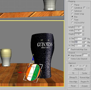
Typically, 3DS Max avoided adding the texture on the correct object, and therefore prevented me from adjusting the bitmap to the exact layout which fitted the cylinder best
As the image shows, I had to resort using the UVW Map for it to even appear, used the 'Box' map and then decreased the tiling on the U and the V segments to 0.8 and 1.3 respectively


By now, lighting was needed for me to gain an abject and concise view of how the final image could look, now that Id incorporated an environment map.
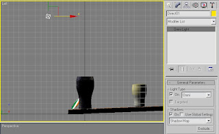
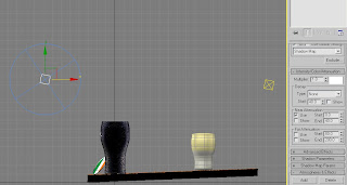
As the map had a bar interior consisting of ceiling light fittings and a large opening of natural light filtering in from the bar entrance, I thought to have a set of two 'Omni' lights, set to a direct pattern, with a shadow map assigned to the object.

^Diagram shows both 'Omni' light positions, as well as the settings used to throw the lighting and creation of the shadows that are currently in the scene (near attenuation selected starting at 0 and ending at 40 points, with a decay starting at 40 points, although unselected at this point)


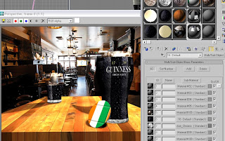
Now it got a mite bit complex. Having returned to the beer glasses after remaining happy with the lighting arrangement, I thought of an idea to which I could have access to all three textures both glasses would incorporate and be able to edit them all as part of one material
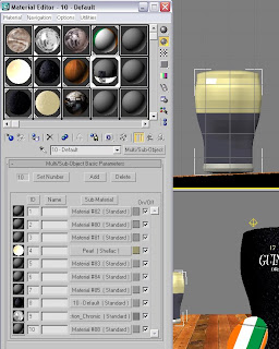
I began the process by highlighting the three varying sections I wanted f the glass itself, numbering each one a separate ID eg. 'head' 1, centre 2, and base 3
Now this was confirmed, I could then select the 'Multi/Sub-Object' layering option and incorporate all three textures that, up until this point, had all been ruthlessly applied and reapplied and, however I admit it, were not going to happen without an in-depth reassessment of my options


Having applied the 'Multi/Sub-Object concoction to the glass at the rear (after having to add the UVW map again - for some reason, I'm sure he computer just didn't have faith in my abilities at pretty much every stage of my Max-usage so far!), I also repeated the process for the forward glass, again changing the IDs for each of the sections and then adding the map on as required (also, by upping the specular levels and glossiness, I could include some believability of the lights above reflecting off the glasses) Of course, this glass hasn't been touched yet, compared to the half-empty glass behind (yes, I could be classes as a pessimist by saying half-empty, but this is the easier to type than full...sorta!) Again, that's the reasoning behind why I increased the size of the head section of the rearward glass and below is how I got the map...

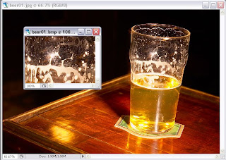
^By finding an image of a half-drunk glass on t'internet, I had the perfect idea for a crop and bitmap-object-orientated texture which could be applied to the head of the glass, with the opacity adjusted so that it has a natural transparency to it^

NOTE: Look away now if you don't want to see a sneak preview of my second finished calender
image...


Ok, you sure you want to see it...


As is clear, the shadows thrown by the dual Omni lights above (one just behind each glass in their respective positions to the table) help the image to appear more integrated to the environment around it.
By raising certain values with the materials placed on each of the surfaces as well, this also encourages greater light sensitivity and adaption to the overall scenes layout adds appeal


Be prepared for another lengthy post on Thursday, and, as you have been prepared before, it will be a two part-er spanning onto next Monday - Valentines Roses will be the name of the game, and I hope you can find it in your heart to appear a little more subdues by my oh-so-effeminate choice of subject matter...its a sensitive side to an otherwise mildly one-dimensional individual, believe me...


Thursday 20 November 2008

Week 9 Part 2 - Half A Pint O' Guinness Please...

I've gotta say first of all, Iv pretty much sorted out the Halloween one now, so be ready for an unveiling of it on next weeks post - you know you can;t wait to see what a travesty Ive created...

Like I said on Monday, this is the second part to the weeks blog update - yeah, I've got some extra images that continue my slow (but steady!) completion of St Patricks Day


What I decided I needed to do was to create a separate 3DS Max file, use a similar method as before to create a spline for the pint glass
This was so that I could edit existing materials and also create a few new ones to apply on this glass - this will then be portrayed as a half-full Guinness pint further back away from the foreground (adds a sense of believability)
By selecting a multi/sub-object layer within the materials library, I could combine my original Guinness bitmap, with my 'beer-head' macro so that each one in ordered precisely


From there, I then went to my initial file, selected 'blend' from the 'file' menu and then brought onto the stage that duplicate pint glass that's going to be half-full (if I can remember what I need to do to create a diverse merge material!)
As the image shows, I attempted a background by adding a custom bitmap onto a plane that's been rotated to stand vertically, a wooden table with a oak/walnut material added and a perspective which allows the table to appear as though its perspective is physically accurate


I was then struck by an idea with which my environment would appear much more encompassing, fitting my table in with greater precision and also providing a much needed natural light source from which I can then adjust my trajectories from where the light source is coming from
As is also displayed, I have added in a beer mat, which I intend to apply a Irish flag texture, again adding to the natural scenery present on screen


The 'Pearl' material has been created specially for the head atop the Guinness within the glass itself, with an emphasis placed on achieving the pearlescent finish - a base material of a preset 'pearl' tone, combined with a shellac material of 'pearl translucency'
This was a two-tone blend which gave a realistic 3-dimensional "roundness" to the texture, a result of the artificial lighting in the scene and the slight decrease in opacity when combined with the shellac material and its relative blend count of between 50 and 75
Once this has been finalized, a process which required a great deal of experimentation with many areas including specular levels and refractive denominations, I was then happy to apply it to the existing glass - signifying a happy reveler in the pub merrily drinking half of the brown ale to celebrate a glorious nationalist day (can you tell that Iv seen much of this happen before!)

^ Details of my settings for the Pearlescent Shellac Material^

NOTE: Look away now if you don't want to see a sneak preview of my first finished calender
image...

*This was actually this final screen dump I took of my Halloween image, but its definitely a very important final stage within its development
Clearly, the whole setting of the scene was pretty much there and sorted, however I was bugged by the gravestone/glyph itself having a too harsh-a glow on the stonework itself, giving the surface and unnatural appearance, especially with the moonlight behind it!
Peace was restored luckily by returning to the material editor and reassessing my five textures I had used for the grave and it was looking under the 'maps' section where I found the problem...
Firstly all of them bar one had a Basic Shader Parameter more reserved for a metallic surface selected (examples such as Phong and Orayl-Neyer-Blinn) where there should have been a Strauss Shader) Also, I'd amateurishly selected self-illuminating and specular coloured maps when it wasn't necessary. Once those options had been put right, I saw an immediate difference - no more ethereal glows, just darkened, more weathered looking stonework which looked so much more effective in this scene (which is hopefully evident from my fished piece below!)


Well, next week will probably be another two part-er basically because I'm going to try and get this all done before week twelve - its going to be near my birthday and so I'd rather not be sitting here on the 6th and still hammering away with my oh-so-wonderful images...

Monday 17 November 2008

Week 9 - Re-Return To The Grave

NOTE: There will be two posts for this week, as I had planned to continue with the route of focusing on one of the three calender items each week in sequence but, the Patrick's Day Guinness glass will also be covered...I explain below why we are wit the Halloween one again! Well, this wasn't planned I know, but...I had a few ideas to make the Halloween grave-thing slightly more believable so I thought Id better get it on here before I forgot/couldn't remember what it was that needed to be done.


This week I found out that to make this scene as realistic and believable as possible, I would need to use the Environment and Effects facility - supposedly a great way to add in the all important ground-fog and perhaps environment image for the background too. I selected the most appropriate effect (volume fog) and I was able to adjust many settings, including density, step size and even down to the noise types and thresholds


I also added in an image of a moonlit sky which I could then use as an environmental effect. By selecting an omni light and turning shadows on, I could then place the light in the position of the crescent moon, thus creating a believable lighting setup


As the image also shows, as well as a shadow cast in front of the gravestone itself, I had also adjusted the fogs positioning so that it looks more realistic and that it could be having a tangible effect on the ground. But, I'm still not happy with that ground texture - its very poorly presented!


^An update of the current image when its rendered - happy about the dying shrub branches and 'stone textures/ not happy about the lack of environmental effects, background or the ground texture.^


And so, due to my negative attitude towards the textures on the surface plane, I decided to do something about it.
So, off to Photoshop I went to construct my own muddy, disheveled and generally unkempt landscape.
I chose two relevant colours - a mossy green and dark umber brown which then were applied using a feathery, randomized almost staccato-in-application brush at 30px size. This took a little while to achieve the desired effect, but it as definitely worth it in the end. After applying the two tones with no real order, I then applied a very dark green, almost black which the same brush, but at around 150px or so for an uneven and disordered appearance


^The finished article, with the tonalities and application techniques as I mentioned above being portrayed here also^

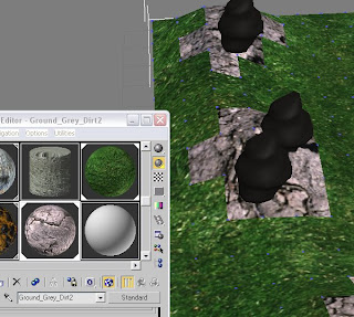
^Evidence of my texture applied, along with my dozen or so other materials in the library, all textures that can be modified in a way that will suit their usage^

Yes, is pretty much complete..now, its a case of finalizing the environment map I have in store for such an occasion and then angling the camera at just the right elevation for a nice dramatic shot..well, that's the plan, anyways

Friday 14 November 2008

8th Week - Return To The Grave!!

Yes, I know this is being posted at the end of the week, and not I usually do at the very start but...

This is my first and, fingers crossed, final return to the Halloween-themed image I'm doing.


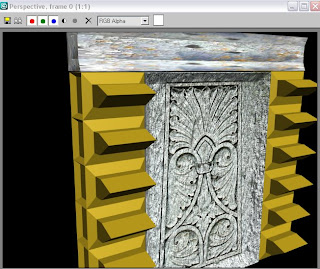
Basically, from the point where I was last time I had been messing this up royally, all I had on screen was the very flamboyant, almost Regal -Crypt-looking gravestone.
This week, I decided that Id had some minor practice in laying textures and editing my own bitmap materials, so I thought I could put it to good use now.
Perusing t'internet for all of 5 minutes, I came across two images that would suit the stone -
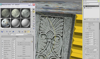
a mossy, aged stone texture from a photograph an individual had taken (which I intended to crop in Photoshop), and a surprisingly apt Neo-Classical design that was already present on a dearly deceased individuals stone (why not extend my gratitude to the deceased by including in my work, I thought very pleasantly!)


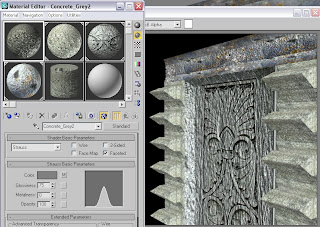
As is usual with most of these things using 3DS Max, luck and chance played a part in making this image turn out as it is here - in my view, a combination of selecting various values (such and 'bump' and 'opacity') and adding the concrete material from the preset library onto channels such as specular level and filter colour, brings out this very attractive, and importantly, believable textures and realistic tonality that wouldn't have been possible without such chance and luck.
Unless of course it was actually a case of me putting to good use my growing skill with this programme,but..its not likely all in honesty!


I then got to work on the 'protrusions', as I like to call them.
As before, perhaps with an unwitting feeling of 'if it worked before, why not attempt it again', I cobbled together a few of the preset stone textures and upped certain 'map attributes' (bump, specular level and self-illumination being three) to achieve the map seen here.
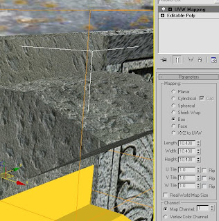
Although, in order to get a greater sense of a material applying itself to an object, one must apply a UVW Map so that an individual is allowed to adjust not only the material properties, but the very mapping formation itself - choosing a 'planer setting' will stretch out the image as it it was on a flat plane for example and the 'cylindrical' setting for a material to wrap around a hypothetical cylinder. This option allows far greater adjustment to any material, not just custom bitmaps.

As the image portrays, my material editor was becoming rather developed, with a total of five materials all for three true surfaces.
To continue from the paragraph above that talked about UVW Mapping, I decided to go from a 'box map' - which, although wrapping the texture in the correct fashion, the individual bumps and irregularities in the stone were too large for me - and so I chose the 'face map', a map which really toned down the surface, but applied a soft payer of almost self illumination and automatic light adjustment to the object itself (in short, the stone looks weathered and beaten)


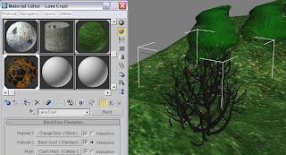
From there, I drew out a plane - which had eight segments for extra adjustment - converted to an editable poly, selected its vertices's and began to pull them out in a crude manner at first, to add in natural dips and pitches in the ground.
I added in a temporary grassy texture (all these will be adjusted before hand in, thankyouverymuch!) and the preset foliage that's in the software (originally trees, but iv shrunk them down!)
As so to appear dead/dying, I also found a lava crust tool which means that the shrub has the usual characterisations of, I guess, a dying shrub


Very quickly now, all this image really shows how amateurish I really still am sometimes (READ AS: usually, in actual fact)
While attempting to try and perhaps blend in a combo and grass that's still partly alive and the soil and earth that's under the dying shrubs could be on its last legs, I tried to show that, without too much effect of any sort.

As you can see there still are a fair few areas which will need work over the next two fortnights afore hand-in, but I'm sure I can manage to create somethings that at least fairly viable for a pass..wish me luck!