I have a few sketches which I will show, and also the original image which definitely sparked an idea of which persona and attitude I was going to follow for him - as it happens, the disgruntled look suited his physical features pretty well, I feel

I think by my subsequent scribblings, its pretty plain to see how I intended to show the alien life form, even if it wasn't the most flattering, it certainly was the most enthralling aspect of the
project at this early stage!
Varied I know, but I felt it was necessary to give every possible idea a chance, even if a certain one wouldn't be easy to accomplish on in 3DS Max, but hey, that's what lecturers are for-to give you their honest opinion of whether something would work, and I have learnt to go with the most likely-to-happen design, which just so happens to look pretty good as well...
I then took my ideal template into Max and began to create my idea - which I can bet will develop more on-screen than what I had drawn out!


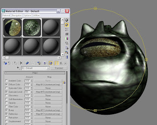
^ This image is to show the slight alteration I made to the axis on which the texture was to be applied according to the UVW map, which I altered from X to Y, meaning the pupil was now on the horizontal, again appealing more to the odd nature of a being from outer space! To finalize this part, I also decided to apply the Bitmap to the several other channels as part of the default window; specular level, glossiness and the two translucency shaders - this allowed a greater level of detail in the texture (I believe it was in this image I had deliberately selected the 'faceted' property within the material library function, as to give the eye greater depth of realism...
Now that the eye has been rotated and given that specular highlight shown, I then wanted to add in the semblance of a mouth for Si.
And now I moved onto the aliens skin texture, would would be used throughout his body. It was found through a search on the Internet, had just the right resolution without and need to crop, and so I Bitmapped it into Max, and began to repeat a similar process as with the lizards eye.
As the image shows, the target was to get as realistic as possible, with a high bump map and specular highlights in select places, but as the image shows, I perhaps had the incorrect parameter from which to start the adjustments (its too shiny even with reflection at 100)


Unfortunately, even though I had thought I had got away with not having to faff around with alignments too much with the tiling of the skin texture, rotating the head around showed me that that tiling was all too obvious to ignore.
I then decided to save the settings before experimenting and, having done that, I then tried out other other UVW mappings. Cylindrical was interesting because while all round the face it was exactly what I was after, the top of the head was as shown, pulled together like a pinched piece of latex..!

I was going to go straight onto another setting but, in a strange twist, I saw the 'cap' option at the side of the point, and so clicked on it just to see what would happen.
As the image shows, I no longer had the crown of the skull pinched inwards and the texture just spread out evenly. And I even managed to highlight the drawn mouth a bit more with use of clever lighting!
Next week, I will finish him off...seems alot of work, I knwo, but once hes done, Si will appear without hesitation in whatever scenario I choose for him (even if he knows it could end in a way he wasn't expecting!!)


No comments:
Post a Comment