The interior of the Death Star in Star Wars may spring to mind, but this is close to what I had imagined in the first place (to this, I will also be adding a window looking out onto a view of Earth from the Moon - the famous one where you just the edge of the Moons cratered surface at the bottom of the image!)
The Kitchen
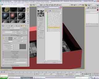 A couple of weeks ago while I was getting to grips with controlling camera paths and constants, I came across a small number of textures with which I created my Space Room with the teapot inside (theres a video a few posts back)
Well, I thought to make use of these materials again as they perfectly suited my actual assignment now, which I didn't plan for surprisingly...
Under the 'Mtl Editor', I re-discovered a texture ('Specular Level Map #43) I previously used on the 'pot itself, but now it was a candidate for the flooring in the kitchen; the alternation between varying shades of grey geometric shapes really grabbed my attention!
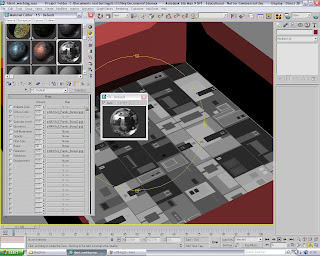 ^ The texture now applied, I could alter the maps characteristics for that polished look! The map was applied to the 'Specular Level', Glossiness' and 'Reflection' channels, all at 100% The enlarged sphere in the floating window allowed me to see my subtle alterations easier^
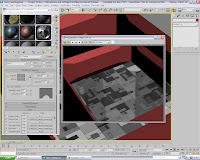 ^This is the kitchen floor rendered - note the ideal amount of reflective detail from anything that may be standing directly on its surface^
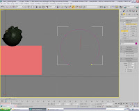 I then returned to designing the archways that would connect the two rooms without unnecessary doors and making sure they open within the animation (too much hassle!)
I began the process by choosing 'arc' under the splines tab, and then pulled out the shape you see to the right...
It was, of course, too circular in appearance, and so I needed to pull up the center in order to truly form an archway to fit the walls correctly.
Therefore,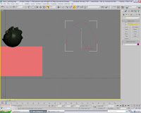 I selected the re-size tool from the upper menu and
re-formed it into the shape on the right.
I was then needing to, in order for 3DS Max to recognise it as a proprietary object ready to be used in the 'Boolean' procedure I had planned, 'lathe' it into a smooth cone so that the 'arc' will still keep all its original dimensions
Although, I had no idea to what the shape would end up as let alone on what lateral direction I was to 'lathe' it in...
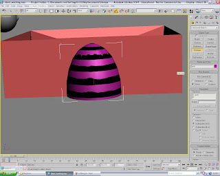 ^The resulting shape/form when the 'arc' is lathed in the 'z' axis. I thought this would be the ideal shape for 'Boolean-ing' out an archway, but Max just wouldn't recognize it as a constant object on screen and, as the image shows, I tried a few options before I decided not to continue^
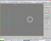 The only other possible way that I knew of was to add a cone onto the stage, creating it 'from center'. I adjusted the dimensions that that it would work much along that same lines as my previous lathed arc, but this time I made sure the shape had enough depth to completely transcend both sides of the wall's depth.
Once all three aspects of the cone were constructed, I could then set about altering the default settings; adding extra sides and height segments, as well as 'smoothing' the whole form.
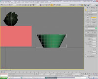 I made small adjustments to the height, mainly because it needed to avoid cutting into the floor, but also not coming into the contact with the walls uppers section, thus making the wall look far too brittle or unworkable for future reference (see below)
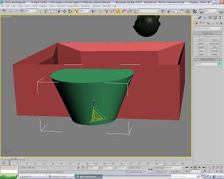
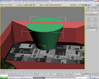 ^The position in which I placed said cone in between both wall surfaces. Making sure rear wall was selected, I then went to 'compound objects' selected 'Boolean', picked 'OperandB' as cone01 and then 'extracted Operand' as an instance, subtracting A from B
Below is the result - note how the wall takes on the form of the preexisting cone all on sides, and how the side walls are almost bevelled due to the angle I made the cone from^
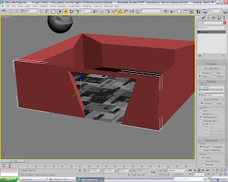
Now I was finished with the basic spatial area in the kitchen, my thoughts turned to the decoration.
I was lucky enough to rediscover the texture I talked about using for my previous camera-path tutorial scene, in which an individual in the class remarked on it looking like "the interior of the Death Star", which I was surprised to hear at that time, but now I think about it, its seems to fit this brief to a tee.
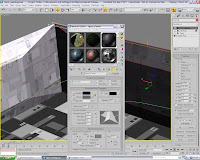 Due to the wall having so many angles on which a basic texture-application could look very untidy, I knew that best way was to ensure a 'UWV Map' was applied as soon as I had re-configured the texture to the use I intended for it in this context.
As the images on the left show, the tiling of the default material needed to be tweaked in such a way as to appear natural and no too artificial. I was pleased wit the outcome (especially when increasing certain attributes only enhances the metallic properties of this material!)
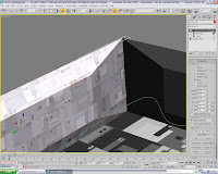
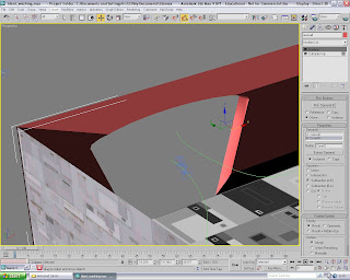 ^Here is a slightly remodeled archway, which was adjusted by taking the wall in 'Sub-Object' level and adjusting the vertexes so that it smoothly curved over (reminded me of a doorway from Star Trek: Next Generation for some reason!). In the scene, you can see the beginnings the of the camera path that I had began experimenting with during this stage!
Below is the wall with the 'android texture' (as I call it) added and its seemed to apply just as well with the box mapping as it has with the other walls...^
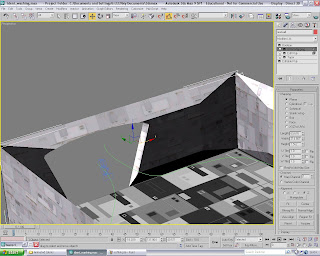
Next post will focus on the addition of the lounge area, and the start of the kitchen furniture, which will of course be suitably quirky and certainly space-age enough!
 A couple of weeks ago while I was getting to grips with controlling camera paths and constants, I came across a small number of textures with which I created my Space Room with the teapot inside (theres a video a few posts back)
Well, I thought to make use of these materials again as they perfectly suited my actual assignment now, which I didn't plan for surprisingly...
Under the 'Mtl Editor', I re-discovered a texture ('Specular Level Map #43) I previously used on the 'pot itself, but now it was a candidate for the flooring in the kitchen; the alternation between varying shades of grey geometric shapes really grabbed my attention!
 ^ The texture now applied, I could alter the maps characteristics for that polished look! The map was applied to the 'Specular Level', Glossiness' and 'Reflection' channels, all at 100% The enlarged sphere in the floating window allowed me to see my subtle alterations easier^
 ^This is the kitchen floor rendered - note the ideal amount of reflective detail from anything that may be standing directly on its surface^
 I then returned to designing the archways that would connect the two rooms without unnecessary doors and making sure they open within the animation (too much hassle!)
I began the process by choosing 'arc' under the splines tab, and then pulled out the shape you see to the right...
It was, of course, too circular in appearance, and so I needed to pull up the center in order to truly form an archway to fit the walls correctly.
Therefore,
 I selected the re-size tool from the upper menu and
re-formed it into the shape on the right.
I was then needing to, in order for 3DS Max to recognise it as a proprietary object ready to be used in the 'Boolean' procedure I had planned, 'lathe' it into a smooth cone so that the 'arc' will still keep all its original dimensions
Although, I had no idea to what the shape would end up as let alone on what lateral direction I was to 'lathe' it in...
 ^The resulting shape/form when the 'arc' is lathed in the 'z' axis. I thought this would be the ideal shape for 'Boolean-ing' out an archway, but Max just wouldn't recognize it as a constant object on screen and, as the image shows, I tried a few options before I decided not to continue^
 The only other possible way that I knew of was to add a cone onto the stage, creating it 'from center'. I adjusted the dimensions that that it would work much along that same lines as my previous lathed arc, but this time I made sure the shape had enough depth to completely transcend both sides of the wall's depth.
Once all three aspects of the cone were constructed, I could then set about altering the default settings; adding extra sides and height segments, as well as 'smoothing' the whole form.
 I made small adjustments to the height, mainly because it needed to avoid cutting into the floor, but also not coming into the contact with the walls uppers section, thus making the wall look far too brittle or unworkable for future reference (see below)
 ^The position in which I placed said cone in between both wall surfaces. Making sure rear wall was selected, I then went to 'compound objects' selected 'Boolean', picked 'OperandB' as cone01 and then 'extracted Operand' as an instance, subtracting A from B
Below is the result - note how the wall takes on the form of the preexisting cone all on sides, and how the side walls are almost bevelled due to the angle I made the cone from^


Now I was finished with the basic spatial area in the kitchen, my thoughts turned to the decoration.
I was lucky enough to rediscover the texture I talked about using for my previous camera-path tutorial scene, in which an individual in the class remarked on it looking like "the interior of the Death Star", which I was surprised to hear at that time, but now I think about it, its seems to fit this brief to a tee.
 Due to the wall having so many angles on which a basic texture-application could look very untidy, I knew that best way was to ensure a 'UWV Map' was applied as soon as I had re-configured the texture to the use I intended for it in this context.
As the images on the left show, the tiling of the default material needed to be tweaked in such a way as to appear natural and no too artificial. I was pleased wit the outcome (especially when increasing certain attributes only enhances the metallic properties of this material!)
 ^Here is a slightly remodeled archway, which was adjusted by taking the wall in 'Sub-Object' level and adjusting the vertexes so that it smoothly curved over (reminded me of a doorway from Star Trek: Next Generation for some reason!). In the scene, you can see the beginnings the of the camera path that I had began experimenting with during this stage!
Below is the wall with the 'android texture' (as I call it) added and its seemed to apply just as well with the box mapping as it has with the other walls...^

Next post will focus on the addition of the lounge area, and the start of the kitchen furniture, which will of course be suitably quirky and certainly space-age enough!

No comments:
Post a Comment